The Power of Infographics
One of the most potent trends today is to help us understand data by representing it graphically in a compelling way. The more compelling it is, the easier it is to remember. Decoding and redesigning the data can be challenging and time-consuming. It requires a rare combination of artistic and technical skill. However, the results are very rewarding.
Consider how much you learn from this simple diagram of the Muslim population:

What did you learn in the last 5 seconds? Maybe that Al Qaeda doesn’t represent even a tiny fraction of Muslims. Or perhaps that the Muslim population is much larger than you previously thought. I am sure that I will not remember the numbers in this image, but there is something about the diagram that changes my perspective and makes the concept memorable. Here are some other infographics and visualizations that you will never forget:
1. Did You Know
This short video gives a series of mindblowing statistics that convince the viewer that we are indeed living in “exponential times”
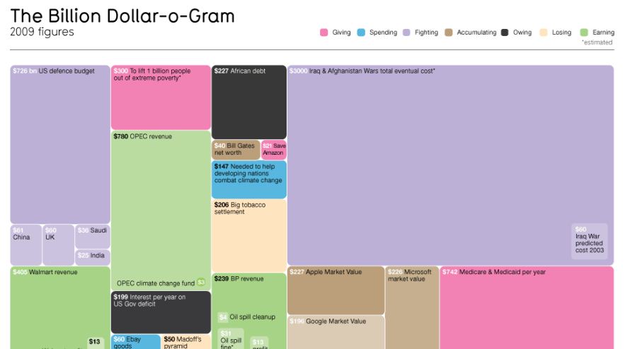
2. Billion Dollar-o-gram
A neat infographic that compares the billion dollar sums we hear about in the news and scales them accordingly (click for full image).
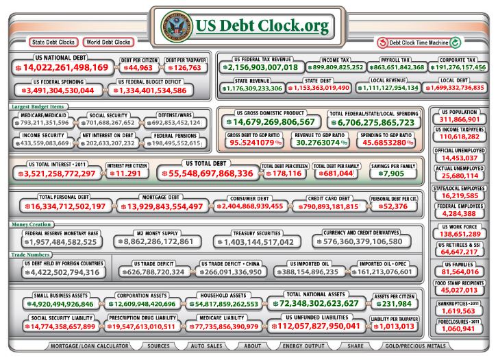
3. US Debt Clock
A running clock that is calculating various aspects of the US national debt (click to see it run in real time).
4. 200 Countries, 200 Years, 4 Minutes
A 4 minute video by Hans Rosling that summarizes centuries of Global Health data into one epic dynamic chart and a discussion on the development of modern society.
Other visualizations are used to describe everything from stories in the news to the size of the internet. You could spend hours at informationisbeautiful.net looking through all the infographics.
Ultimately, the world is glutted with data and if you’re a visual learner like I am, then the statement that there are 600 sextillion stars in the universe doesn’t mean a whole lot. Now, draw me a picture of that, and then we’re talking.