How I rebuilt "Flying Toasters" using only CSS animations
One of my favorite classic screensavers from back in the day was “Flying Toasters,” a part of the After Dark bundle.

Ahhh. Those were the good old days.
As a front-end developer, I started wondering if you could recreate the magic using only CSS. The answer, as you probably guessed is, yes, you can (you can see it in action here). Here’s how I went about doing it.
Step 1: Get a single toaster to flap using CSS spriting
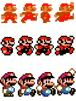
Getting a character to move isn’t new, and one of the classic techniques is to put together a “sprite sheet,” which is an image that contains all the individual frames of your animation.
You may have used sprites to capture the hover and active states of your menu buttons, but you can also use them for animations. In my case, I needed an image with the toaster in different phases of flapping. Here’s what I came up with:
To give it the appearance of motion, we need to hop rapidly from one frame to another. We do this by creating a box with a fixed width and height and putting in our image as a background image.
<!-- the HTML -->
<div class="toaster"></div>

/* the CSS */
.toaster {
  position: absolute;
  background: url(/assets/images/toaster-sprite.gif);
  width: 64px;
  height: 64px;
}
Now we want to move the position of that background image between each of the sprite frames. We do this by defining some CSS keyframes (you’ll want vendor prefixes on many of these rules for cross-browser compatibility, but for the sake of brevity, I’m leaving them out).
/**
 * Our image is 256px wide so this rule tells the image to shift
 * to the right the full length of the image.
 */
@keyframes flap {
  from { background-position:  0px; }
  to { background-position: -256px; }
}
By themselves, keyframes won’t do anything. You need a CSS rule to call them with the animation property.
/* This runs the animation named 'flap' over a period of 0.4 sec. */
.animated {
  animation: flap 0.4s;
}
But this won’t really work. First, the background image will slide constantly, when what we want it to do is jump: 1st frame, 2nd frame, 3rd frame, 4th frame. Second, the animation will only run once by default, and we want it to run constantly. Finally once the animation runs once, we want it to run once in reverse, so the wings flap back up. You can look up the values that define these behaviors, but here’s what it looks like when we add them in:
<!-- update the HTML -->
<div class="toaster animated"></div>

.animated {
  animation: flap .4s steps(4) infinite alternate;
}
You can see a demonstration of it working in this Codepen embed:
See the Pen CSS Sprite Demonstration by Bryan Braun (@bryanbraun) on CodePen.
Step 2: Fly across the screen with translate()
With the flapping part done, we just need to move it across the screen. The toasters fly from the top-right to the bottom left, and we could choose to animate this by changing the value of z-index or by using a newer function called translate(). According to the fine folks at HTML5Rocks, animating translate() is more performant than z-index, so we’ll go with that.
/* Position our toaster just off the screen at the upper right */
.p1 { right: 10%; top: -10%; }

/**
 * Define keyframes to translate it to the bottom left.
 * We'll use -1600px since that will be wider, and certainly taller,
 * than most standard screens.
 */
@keyframes fly {
  from { transform: translate(0, 0); }
  to { transform: translate(-1600px, 1600px); }
}

/* Update our animation to include our translate() keyframes. */
.animated {
  animation: flap .4s steps(4) infinite alternate, fly 10s linear infinite;
}

<!-- update the HTML -->
<div class="toaster animated p1"></div>
Now we have a single flying toaster. Whoo hoo!
Step 3: Add in some flying toast
But what’s a flying toaster without toast?

Animating the toast is easier because it doesn’t need to flap. We just get a single image of toast and move it across the screen. In fact, we can borrow the same position and keyframes we defined for the toaster.
/* Set up our toast object */
.toast {
  position: absolute;
  width: 64px;
  height: 64px;
  background-image: url("/assets/images/toast1.gif");
}

/**
 * Toast-specific animation (needed since our toast doesn't flap)
 * Notice that I added a 6s delay, so it comes after the toaster.
 */
.tst1 {
  animation: fly 10s 6s linear infinite;
}

<!-- Toast HTML -->
<div class="toast tst1 p1"></div>
As you can see, the code is very similar to that of the toaster.
Step 4: More toasters! More toast!
With all the hard work done, we just need to throw a whole bunch more toasters and toast in there.
We want them to come onto the screen from all different places, so we’ll define several more starting positions (similar to .p1 & .p2).
.p6 { right: -2%; top: -10%; }
.p7 { right: 10%; top: -12%; }
.p8 { right: 20%; top: -18%; }
.p9 { right: 30%; top: -13%; }
.p10 { right: 40%; top: -17%; }
/* etc. */
We’ll want a few waves of toasters to keep the screen covered while we wait for the first round to repeat again, so we’ll add more animations (which I’ll call .t1, .t2, etc.) with a starting delay on them. We also want toasters flying at different speeds and ones with wings flapping out of sync with the other toasters. For that, we’ll define even more animations with various adjustments to the properties.
.t1 {
  animation: flap .2s steps(4) infinite alternate, fly 10s linear infinite;
}
.t2 {
  animation: flap .2s steps(4) infinite alternate-reverse, fly 16s linear infinite;
}
.t3 {
  animation: flap .2s steps(4) infinite alternate, fly 24s linear infinite;
}
/* etc. */
When it’s all done, we have a big stack of toasters and toast, starting at various positions, running various animations:
<div class="toaster t1 p6"></div>
<div class="toaster t3 p7"></div>
<div class="toast tst1 p8"></div>
<div class="toaster t2 p9"></div>
<div class="toaster t1 p10"></div>
<!-- etc. -->
Finally we have it: the flying toasters screensaver.
I’ve put the source up on Github, if you want to take a look. It’s part of a whole set of After Dark screensavers that I’ve animated with CSS (including Fish, Warp, Rainstorm, Messages, and others). Definitely check them out, if you miss that part of the 90s.