Writer: A Blogging Theme for Developers
I’m happy to introduce Writer, a Drupal theme designed for developers who blog.

The story is quite simple. I am a front-end developer who blogs. I searched the Drupal theme repository, but I was unable to find a blogging theme designed specifically for developers. So I made one.
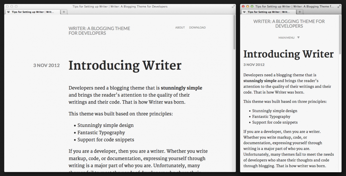
This theme was designed using three driving principles:
- Brutally simple design
- Fantastic typography
- Support for code snippets
These principles guided me through the trade-offs and helped me make various design decisions. Let’s get into the details.
Brutally simple design
Developers have different needs than other bloggers. They don’t need sponsors or advertisements. They don’t need dancing emoticons or pink text on a purple background. They need… well, I wasn’t exactly sure what they needed. So I began asking them.
Design-wise, the answer was always “something simple.” Basic. Clean. As I continued my research, I looked up the blogs of many prolific developers to see what designs they used. Lo, and behold, the pattern was the same: “something simple.”
- Blog of Jeffrey Veen - Designer, author, past employee for Google, and Adobe. Founder at Typekit, Adaptive Path, Wired Magazine, and others. Seriously, he invented, like, half the internet.
- Blog of Evan Williams - Created two of the Internet’s top ten websites (Blogger and Twitter), among other projects. His “something simple” design preference is also evident on the website of his newest startup, Medium.
- Blog of Mark Boulton - Top designer, author, conference speaker, publisher. He founded a design studio in his name. Need I say more?
- Blog of Nick Disabato - An accomplished designer and publisher.
- The 37 Signals Blog - Official blog of an influential software company, highly regarded for it’s success and refreshing attitudes about business.
- Blog of Ben Dowling - Engineer at Facebook, iPhone developer and founder of other projects.
- Blog of Nicholas Gallagher - Front-end engineer at Twitter and open source contributor.
… and others like the blogs for Armin Ronacher, Brandan Lennox, Wynn Netherland, Daniel Eden, Brandon Keepers, Frank Chimero, and Geoff Greer.
After checking out those designs and being sufficiently inspired, I brought my favorite attributes from all of them into Writer. Some of those attributes were:
- Three-tone color Palette: #F7F7F7, #888888, #292929 (There’s just something nice about nearly-black on nearly-white)
- Single column layout. Say no to sidebars.
- The golden ratio (1:1.62) was used for font and line-height relationships.
Fantastic Typography
On a design this simple, the typography is extremely important. This theme uses three fantastic fonts:
- Merriweather - slab serif (titles and body text), by Eben Sorkin
- Lato - sans serif (header, footer, and dates), by Lukasz Dziedzic
- Inconsolata - monospace (code snippets), by Raph Levien
These fonts are all hosted by Google Fonts and it’s almost embarrassing how much time I put into finding and selecting them. Huge thanks to these font builders who chose to share their craft free of charge. I’m really pleased with the result.
Support for Code Snippets
If you had 4 hours to dig around through Drupal contributed modules and third party libraries, you could figure out a way to get styled code snippets on your site. But you don’t have that kind of time, so Writer comes with 4 code styles out of the box. Just go to the theme’s settings (at /admin/build/themes/settings/writer for Drupal 6, and /admin/appearance/settings/writer, for Drupal 7) and select the one you want.

This table shows what each style looks like for blocks of code (left) and for inline code (right).

To invoke the style when you are blogging, wrap blocks of code in “pre” tags or wrap inline code with “code” tags.

That’s all there is to it.
A higher purpose.
There are many great Drupal developers who continue to use Garland or Bartik (the default Drupal themes) as the theme for their blog. These themes are fine but they were never designed to be used for a blog (not to mention that some would say their overuse has made them tacky). I don’t blame them… their alternative options are often bleak. Sometimes when I browse themes at Drupal.org, I feel like I’m browsing the web in 1994.
We developers deserve better.